Usability Report
Overview
The “usability” of a website refers to whether or not a person of average ability and experience can easily determine how to use the site to accomplish desired tasks.
This report is a general assessment of your website’s usability based on several key factors examined on the primary home page. The review was not exhaustive. However, it does provide a sense of what your customers might experience when using your website.
Usability Strengths
Strong Organization Clarity: Visitors can easily understand what the organization is about and why it exists, creating instant credibility and connection.
Usability Problems & Recommendations:
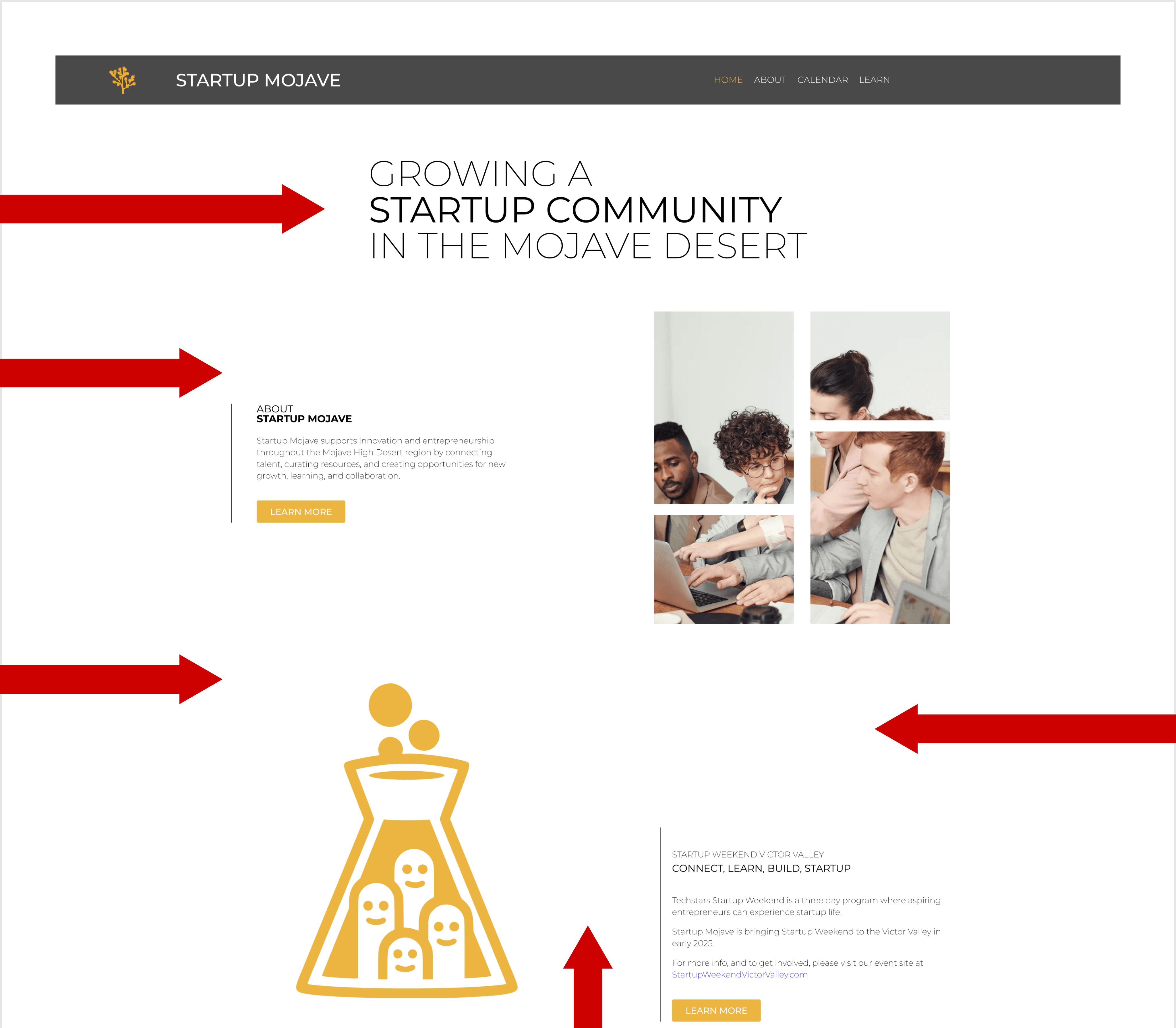
The following screenshots contain the top five issues that were identified problems.Each screenshot includes recommendations for fixing them.
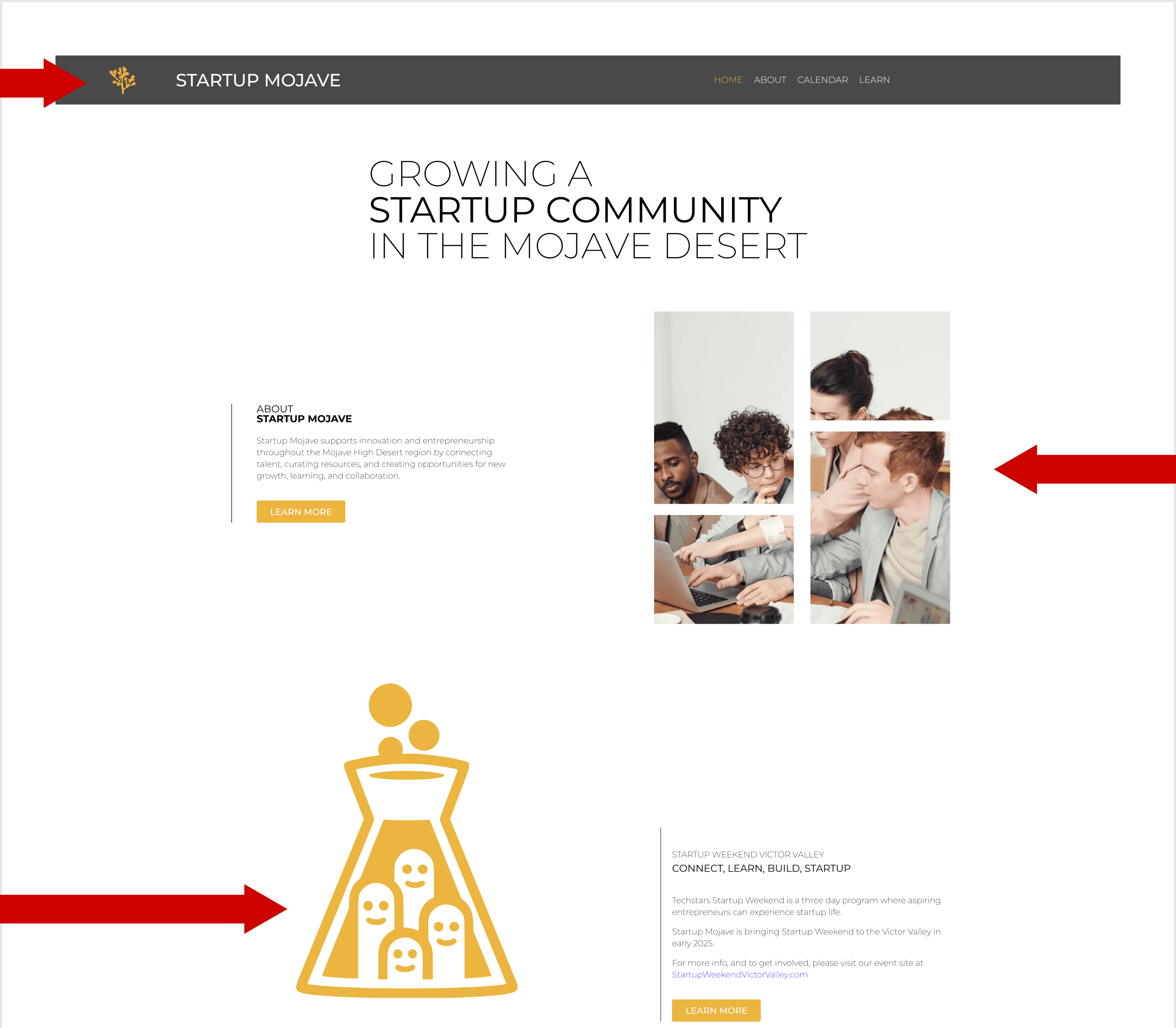
High Priority Issue 01
Problem
Seven images lack Alt Text. This is a High Priority WCAG 1.1.1 failure, making key content and links inaccessible to screen reader users. Must be fixed ASAP.
Recommendation
Audit all 7 images immediately and implement descriptive Alt Text for informative visuals and functional Alt Text for links.
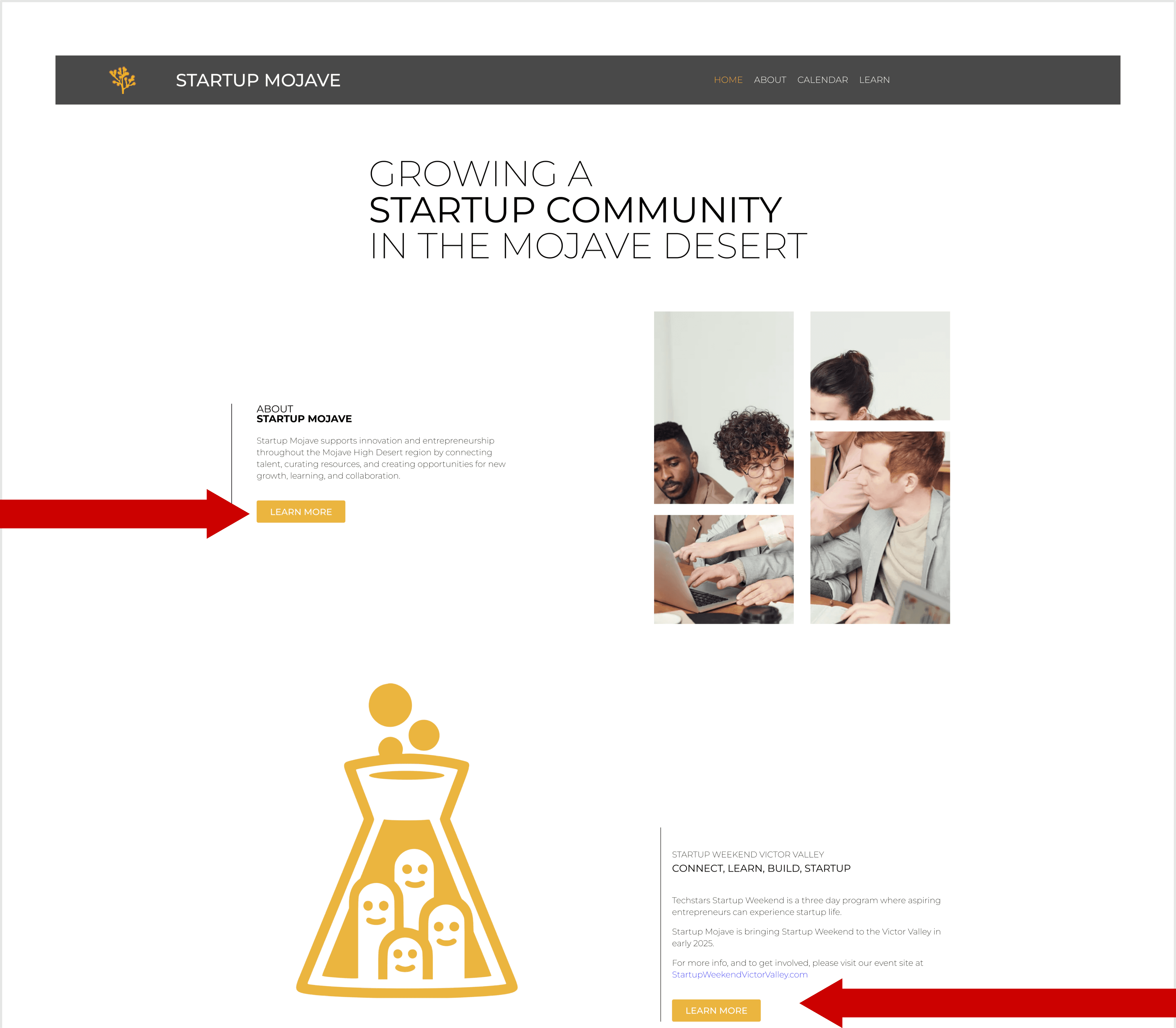
Moderate Priority Issue 01
Problem
Four low contrast errors (1.87:1) are severe failures. This violates WCAG 1.4.3, making text unreadable for users with low vision or color blindness. Must be fixed.
Recommendation
Increase contrast on all 4 affected button elements. Ensure text/background ratio meets WCAG minimum.
Moderate Priority Issue 02
Problem
Heading Level Skipped (e.g., H2 to H4). This is a WCAG failure that disrupts document structure, confusing screen reader navigation and negatively impacting SEO.
Recommendation
Ensure a logical, sequential heading hierarchy (H1 ➞ H2 ➞ H3 ➞ etc.). Do not skip levels to maintain a clear document structure for all users.
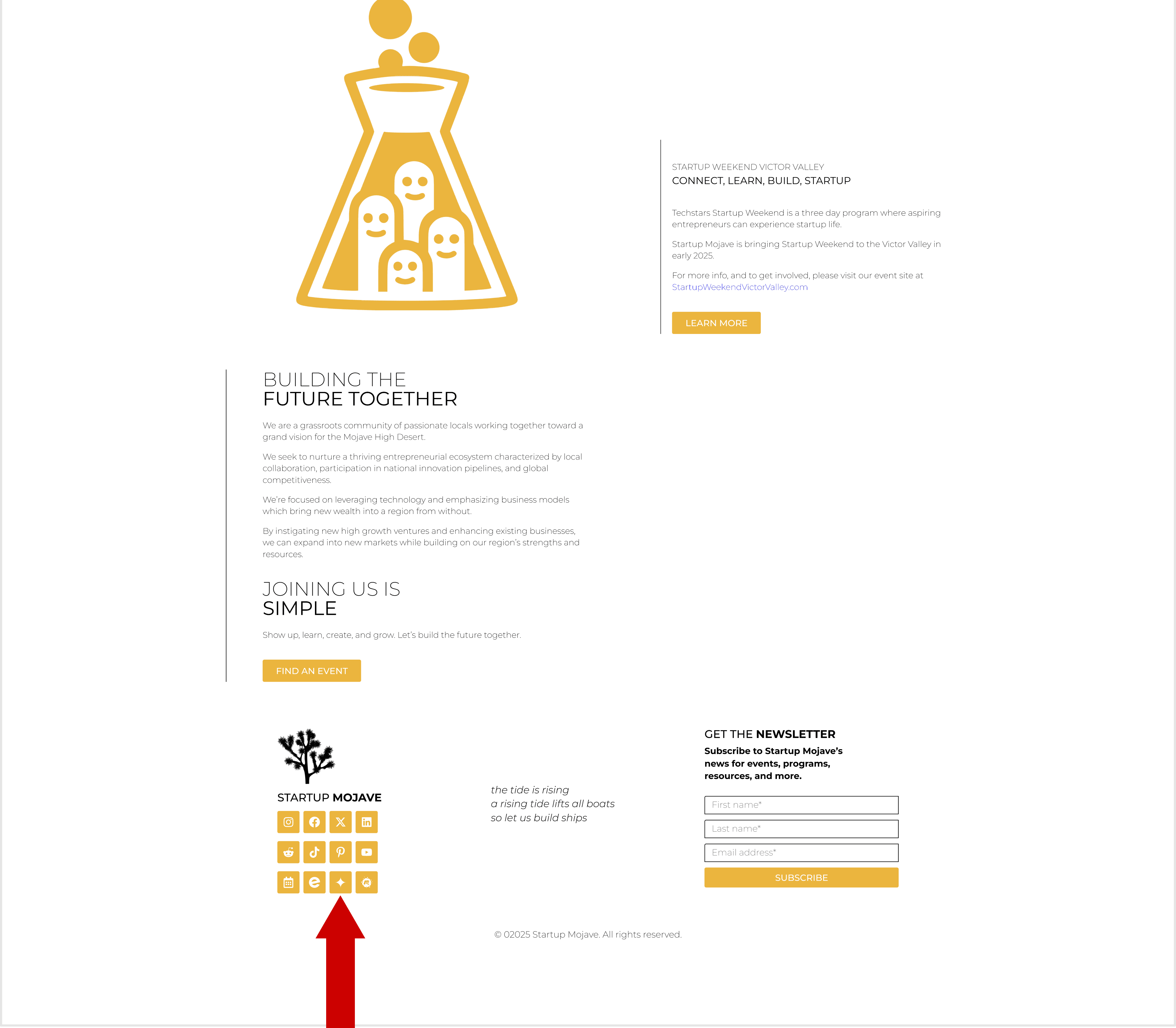
Moderate Priority Issue 03
Problem
Link has no discernible name WCAG 2.4.4. The external link is present but lacks descriptive text/alt attribute, making its purpose inaccessible to screen readers.
Recommendation
Add a discernible name via descriptive Alt Text to the icon, or use aria-label on the link tag. Purpose must be clear to users.
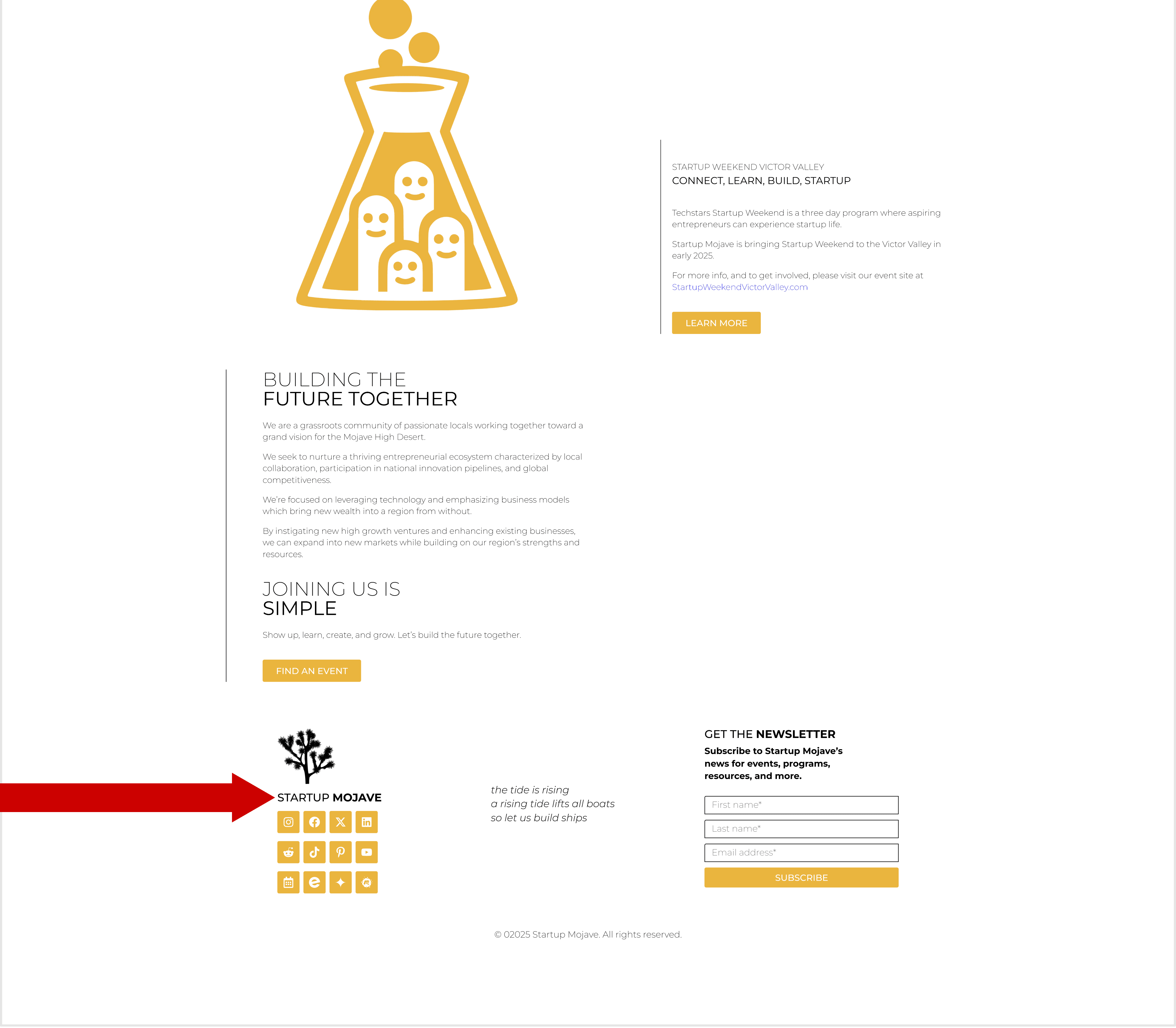
Low Priority Issue 03
Problem
Excessive spacing and alignment is creating large gaps that disrupt reading flow and make the page feel fragmented, hindering comprehension.
Recommendation
Increase contrast on all 4 affected button elements. Ensure text/background ratio meets WCAG minimum.
Contact:
For questions about this review, please contact Nazario Lechuga.